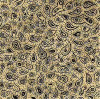
From the analysis of the three album covers that I completed I have taken two main things away from it that I want to include on my own CD cover, and therefore the general theme for the rest of my digipak. These two things are that I want it an illustration over a photo as I think it is more creative and also is reminiscent of what other artists in the same genre sometimes do and the other thing is that I want it to be a pattern- this is because I think it is quite an original idea and is a bit different.
To further this idea I drew a pattern, similar to the one I took my inspiration from and then scanned it into the computer and using Photoshop edited it to get different effects so I could analysis and choose which suited best.
Original Scan of pattern Enhanced through contrast
Background Colour Changed Black & White
Background colour changed Inverted
Inkwell effect Background colour changed
These are the results I got. The ones I like best are the 'Inkwell effect' and the 'black & white' ones. However, I think the original image could be improved by using colour so I intend to add to it and then redo this to see which alternative ideas I can get. Overall though I am happy with this drawing pattern idea and I think it will work well and should look effective as a case for my CD but also as a running theme for my digipak.


No comments:
Post a Comment