Tuesday 28 February 2012
Final Digipack - Izzy
This is my second draft for my digipack. I am aware that it is completely different to my first one but I feel that it suits the genre more and is more aesthetically pleasing.


I took a lot of my inspiration from the Vampire Weekend Contra cover as I felt it best suited the genre of our band and music video, I like to think it gives more of a 'house style' in comparison to my previous draft.
Final Advert - Izzy
Again, I decided to update my magazine advert accordingly to my digipack as it obviously has to match. Here is my first draft for my magazine advert;


Saturday 25 February 2012


Wednesday 21 December 2011
Friday 9 December 2011
How did you use media technologies in the construction and research,planning and evaluation stages?
The most fundamental technology used during the entire process of creating and evaluating our video would be blogger. This is the website we used to present all of our work, right from research and planning to when we finish our evaluations. It has proved extremely useful as it is easy to use and me and Lydia can clearly see who has done what post and what needs to be done. My personal opinion is that it is simple yet effective to use when creating a portfolio of the process of our work.
To present our mood board of ideas we used animoto. Having previously used it for my magazine pitch in AS I knew how to make it look effective using minimal words. My personal opinion on animoto is that it makes the images and music look 'slick'.
Another technology we used was scribd. This was very helpful when drafting work and making it readable without looking boring. When presenting work I think that presentation is extremely important.
To communicate with each other we used our iPhones, we used iMessage to communicate when arranging times to film and to contact the band. We also used Skype to send images and links to videos of what inspired us. The main technology we used for our ancillary was photoshop. This allowed us to edit images and create our digipacks to the best of our ability. When creating our video we used adobe premier elements which was the most frustrating piece of technology to use with. It took about four times as long to produce anything as the programme refused to load or froze and crashed thus saving none of our work. This was extremely frustrating as this wasn't our fault.
To take images for my ancillary text I used a sony lumix camera. It is a very high mega-pixel camera so it allowed me to take high quality images for my advert and digipack
I have yet to finalise my decisions on how to present my final evaluations.
I will elaborate this further for my final evaluation.
Thursday 8 December 2011
Izzy Q1 Evaluation draft
In our music video we definatley used and challenged forms and conventions from real media products. The first scene opens with a midshot of a roundabout spinning really fast, we were strongly inspired by Bombay Bicycle Clubs 'Always Like This'. We felt it was an intriguing opening to the video and would give an enigma code (Barthes) to encourage them to carry on watching the video. We also chose to use the sped up clip not only because it was on Bombay Bicycle Club's video but we felt that in order for the video to match the song, we would have to speed the clips up as it is such a fast song. The second clip of Jake then Harry then Sam sat on the roundabout was inspired by our first video draft, in which we attempted to do stop start animation which was unsuccesful. We also used inspiration from stop start videos such as Strawberry Swing - Coldplay and End Love - OK GO. By using a fast cutting rate we could increase the pace of the video to match the song, we also thought that by doing each of the band members one at a time it could introduce them.
When deciding on how to dress our band we adopted the current conventions of having them all wearing similar clothes which matched the style of the band and their target audience. We had the lads dress in normal clothes as we didn't want to alienate the viewer, we also didn't have them wearing matching clothes like Vampire Weekend do in A-Punk, we wanted them wearing different clothes that matched with the 'indie' genre, much like Two Door Cinema Club or the Arctic Monkeys. We also decided to do this as we wanted to stick to our research and planning as much as possible, and as they were a small band releasing their debut single we didnt think it would be right for them to have all of the elements of a succesful band with 3 albums. We dressed them in t-shirts, shirts, jumpers, jeans and trainers - everything that you would expect from a new formed indie band. We also dressed them like this because the style they had wouldn't be dissimilar from the expected target audience.
As the song was so fast paced we had to make the decision of whether to make it serious, or make if fun. We chose to make it fun as it would be extremely difficult to make a serious video with such a short, fast paced fun. We took some inspiration from Vampire Weekend's A-Punk, in which they are al singing yet are having fun. It would have been extremely aspirational to create a video like theirs purely on the basis that we didn't have a large space with a white wall behind it.
Our three main locations in our video are the park, the underpass and the garage doors. However after deciding to do a disjunctive style we thought that our video would be quite frankly, boring. So we decided to look for inspiration for short shots elsewhere. Again, in Bombay Bicycle Clubs Always Like This there was a clip where a dog runs across the shot, we thought this could look good if filmed in the correct place such as a large field. We chose to do these main locations as they are easily identifiable by the audience and would make the band seem more 'on their level' as oppose to artists who perform in videos that wouldn't relate as much to their target audience.
Having three main locations gives us three paralell 'storylines' so to speak, as they are all in the same outfits in each, this gives continuity and almost familiarises the audience with each location as it is played more than once. We also tied up each location with an ending shot from each - Putting down the instruments and walking off on the garage shots, Hugging in the underpass and Jake jumping off the swing in the park. We thought that by giving these locations individual endings it finished off our video nicely and looked more professional, rather than just leaving locations 'hanging'. This challenges conventions used in generic videos
The 'Walk Don't Walk' man and the traffic light idea stemmed from Daft Punk is Playing in My House - LCD Soundsystem, where they have a few shots of traffic lights. We thought this looked good so we decided to take inspiration from this idea.
The garage door's again, was taken from Bombay Bicycle Club's - Always Like this, as I lived not far from a location where there was a row of garages similar to ones in the video - however the ones we had weren't particularly nice colours, but then again this was something we couldn't change. We wanted some shots of the band performing so we decided to to have them perform in front of the garages.
As our video was so short and very fast paced we found it hard to get in an actual storyline, so there aren't any action codes as such as it wasn't necesary.
In the clips of the band in the underpass we chose to do stop start there as-well as we wanted to keep a running theme of that technique. We decided it would be an aesthetically pleasing technique as we have seen several music videos on the internet and it fits the genre of 'indie' as they don't use expensive techniques as seen in Pop or R&B videos.
In our research and planning we stated that we would like to use a lot of colour in our videos, so we tried to incoroporate this into our video as much as possible. We also decided that we wanted to use lights in our video as well as we liked the effect it had and made it more visually stimulating.
The roundabout on the park was vividly coloured so this set the tone for the mise en scene in the video.
We took inspiration from the lights in the background on the opening of MGMT's Kid's as we thought this was a generic convention used by music videos and thought that this reminded us of streetlights. So when shooting the trolly clip we made sure the streetlights were in the background as we liked the 'glow' look they have when they are not in focus. This led us on to thinking that car lights would look as equally effective. We filmed around 5 minuets of traffic on a dark road, then sped it up when we came to editing it as it would be extremely random just to have slow cars going past in our video. We chose to do it on a dark road as it emphasised the lights going past and it gave that 'glow' effect that we desired.
Another element with lights we decided to shoot was the 'Walk Don't Walk' man and the traffic lights, we liked how the shots looked when sped up in LCD Soundsystem's video of Daft Punk is Playing in my House. We decided just to do the close up of the lights as it was more practical for us and it had the effect that we wanted.
Overall our video takes conventions from Bombay Bicycle Clubs - Always like this, as it was video that we could acheive without being unrealistic. We took elements from that and others that we were slightly inspirred by to make our overall video work together. We were extremely aware that nothing is original so we bared that in mind whilst storyboarding our video. We watched a large amount of videos so we could essentially cherrypick the ideas that we liked and put them into our video.
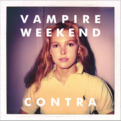 However my digipack was strongly influenced by Vampire Weekends Contra. I took and used the convention of the single girl on the cover of the album as I enjoyed the minimalistic and the simplicity of it. I liked the orange/purple tint on the cover, and also enjoyed the layout so I thought I would attempt to create a different copy of this. I have a friend who suits the genre and has a dress sense to one I would want on my cover. I took over one hundred photos which isn't as many as they would take for a professional album cover but I was sure that I would have as many photos that I would need to pick one succesful one for the cover. After taking a variety of different shots I found three that I wanted to use for my cover, my back cover and the inside panels. I edited the colours to make it look similar to Contra as I really liked that effect. I also edited the colours on the whole of the digipack as I wanted it to have a running theme throughout my digipack. I didn't take inspiration from the back pannel as closely to the Vampire Weekend back cover, however I think my digipack worked. I also took inspiration from Coldplay's Mylo Xylto's 'commendations' as I was unsure on how to lay mine out to make it look professional. I also used a panoramic view for the inside of my digipack as I thought that it kept the running theme which is something that would have been used in generic album covers.
Subscribe to:
Posts (Atom)